All posts by Jacob R Coffman

Fisher House

The Fisher house was designed by Louis Khan and built in 1967. The work is composed of two separate buildings, with one being two cubes intersecting at an odd angle. This makes all three buildings feel disconnected, this along with the natural hue of the building give it the feeling natural rock formations jutting from the earth. It doesn’t blend into nature like with the Kaufmann House, but rather creates a massive yet natural appearance. Another feature that gives the buildings a natural and uneven look (like the majority of rock formations), is the usage of different size, shape, and depth of the windows. This house also uses natural light, but it uses it in a much more direct and traditional manner than many of his buildings, in my opinion giving it more life. This house was designed to make you feel like you are living in a piece of nature, and it does this using natural light to create a home..

First Unitarian Church of Rochester

The First Unitarian Church of Rochester was completed in 1962 and was designed by architect Louis Khan. Like many of Khan’s other works this building has no ornamentation on the outside, and on the inside even the organs, often ornate by design, are minimized and have little effect on the building. This building also takes the natural light and reflects it off bare concrete, giving a softness and certain irreverence to the building. I think this building also represents Khan’s own religious notions, there is no religious iconography, which makes sense with Khan not being associated with any one religion. There is also very little attention paid to the interior of the building, which seems like it was designed that way so it wouldn’t distract from the spiritual purpose. This building was designed very simplistically, to play with soft natural light and help people experience the spirituality they came there for.

Philips Exeter Academy library and dining hall

The Phillips Exeter Library was built by architect Louis Khan was completed in 1972, and the building is currently used as a library/dining hall. The exterior of the building is brick and the majority of it is taken up by windows, showing Khan’s love of natural lighting. Like the Salk Institute, it also has very little ornamentation, rather finding beauty in the simplicity and the beauty of the materials. The interior of the library is designed to let in soft light, the large windows bathe the concrete X in sunlight, which disseminates through to the lower floors. This soft light goes well with the silence of the library, allowing great focus and energy to be put into whatever is being studied. The giant circles create an open feeling in the building that spans across the floors, this also allows the soft natural light to reach farther into the interior. They also give the building an organic feeling, and is reminiscent of how a tree brings nutrients from roots splayed out in all different directions, back to the central trunk. This building was designed with the intention of bringing out the beauty of brick and using natural light to create a calming atmosphere and it succeeded on both fronts.

Salk Institute

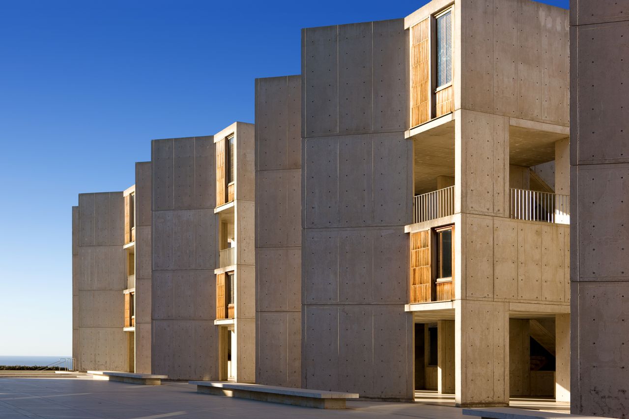
This is the Salk Institute, designed by Architect Louis Khan, which is a research institute which looks like it was designed to allow people to focus on their research. This building reminds me of form over function, and a very basic and intentional design, since there don’t seem to be any features that are purely ornamental. The building was designed to be as enduring as possible, that way instead of patching and repairing resources could be put into the actual science that is being researched there. This can be seen through the very basic, (but sturdy, rigid, and enduring), concrete walls. The building also features several labs with large windows, and was designed with the express purpose of letting natural light reach even the lower lab levels. This building is a testament to what architecture can be, simple, elegant, in communion with nature, and enduring with very little upkeep.

The blender (PHSC)

Everyone I’ve ever talked to about this building has said how ugly it is (even though the chem building is much worse on every front), however it has a lot of redeeming features alongside the bad. The bad is the fact that it doesn’t match the rest of campus, if they had taken the time to put a layer of brick it would blend in a lot better. Another, and much larger, negative is that all the classrooms on the first four floors lack any windows and have plain white walls, which aren’t enjoyable to be in for a semester or even a single class. The positives of the building are that it is well designed for its intended purpose and the classrooms above the fourth floor are great. It was originally designed to be riot proof and with only three doors over the first two floors, no windows on lower floors, and nothing to burn, it is very riot proof and probably one of the safest buildings on campus. The classrooms below the fourth floor don’t have windows and are cinderblocks painted white with basic linoleum floors, but after the fifth it becomes sheetrock and carpeted. The interior design after the fifth floor is fine, but the best part is the view of campus. I had a course on the 11th floor and could see for miles and this view was even better when it snowed. The Physical Sciences Center, aka the Blender, is an often hated building on OU’s campus, but the building definitely has some redeeming qualities.

Stockholm concert hall

While on a tour of downtown Stockholm Sweden, there were many buildings on the tour, but my favorite among them was the Stockholm Concert Hall. While many of the buildings were created with nice stone and ornate design, this building provided a nice contrast, with a dull blue color and very little ornamentation. The design was nice, but the most impressive feature was that every year it hosts the Nobel Prize award ceremony. My dream, as someone in the sciences, is to make a contribution worthy of this award, and the building represents what would likely be one of the greatest achievements of my life. What also amazed me about the building, was that when it isn’t hosting award ceremonies, the courtyard in front of the building is filled with vendors in pop-up tents selling fresh flowers and produce. It is nice that a building can be used for such a prestigious event, and still allow everyday people to build a connection to it through visiting or working in the marketplace.

Dan little residence hall

The Dan Little Residence Hall is where the students of OSSM live during their two year high school experience there. The school is dedicated to helping many students in Oklahoma learn and grow, and that comes through in the design for the residence hall. There is a focus on common areas where teachers and students can congregate, study, and learn. When you walk up to the building a sense of security comes through in the design, with large concrete walls and bars on the windows it is reminiscent of a prison. This sense of security was designed to keep parents at ease despite being most of them being separated from their children for the first time. It wasn’t simply academic through, the building represented the best thing about OSSM, the people I experienced it with. Every night we would be sealed in from 8 pm to around 6 the next morning, and we would spend these hours, and many more goofing around and building friendships. The first time I walked in the building was foreboding, looking like a prison, but by the end of the two years it represented some of the best times of my life up to that point.

The Stadsbiblioteket

While traveling through Europe my favorite activity in each new city was to walk through downtown and observe the architecture and vibe of the people. While walking through Sweden I noticed a massive orange pillar towering above the surrounding city, I didn’t know at the time but it was the Stadsbiblioteket, a Stockholm Public Library. This building was designed without a lot of ornamentation, but rather a monumentality greater than expected from a building that size. It was also designed as a public space to bring people together, and was one of the first modern libraries of Sweden. I first explored the entire exterior of the building and learned it was nearly the same from all sides minus a doorway. I also learned that it was open and I ventured inside, as I walked through the unassuming entrance I didn’t expect three stories of books 360 degrees around me, and I was amazed at the immensity of the building. The building was not quite as you’d expect a library, but rather bustling and filled with life, which was unusual for but still nice. This building made me feel comfortable, looking at the massive construction it is wonderful that such a warm atmosphere was able to be established.