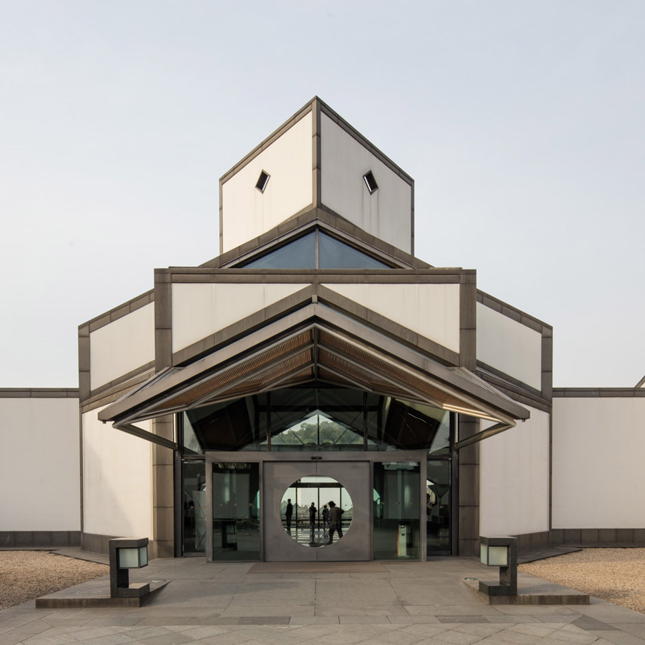
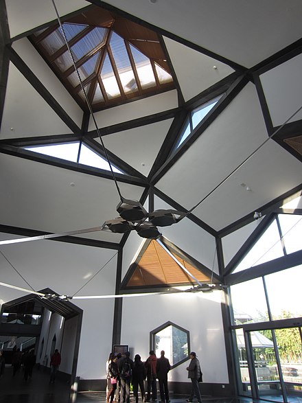
The final design of Pei’s career was the Suzhou Museum, completed in 2006. It uses a combination of aesthetics traditional to the area, as well as Pei’s iconic use of glass and complex geometry. It is a modern interpretation of a traditional style of architecture. There is an atrium within the structure that allows natural light to flow in from above. The use of glass enhances the pond surrounding the museum, and is a beautiful building that overall enhances the natural environment. I really like this building, and I feel is one of the buildings that strays more from the style that Pei is typically known for as it makes use of those more traditional elements and interprets them in a more modern way. However, as you enter the structure the ceiling displays the instantly recognizable use of triangles that Pei uses throughout his designs, and the illusion it creates is very modern, but simultaneously a very comfortable space.
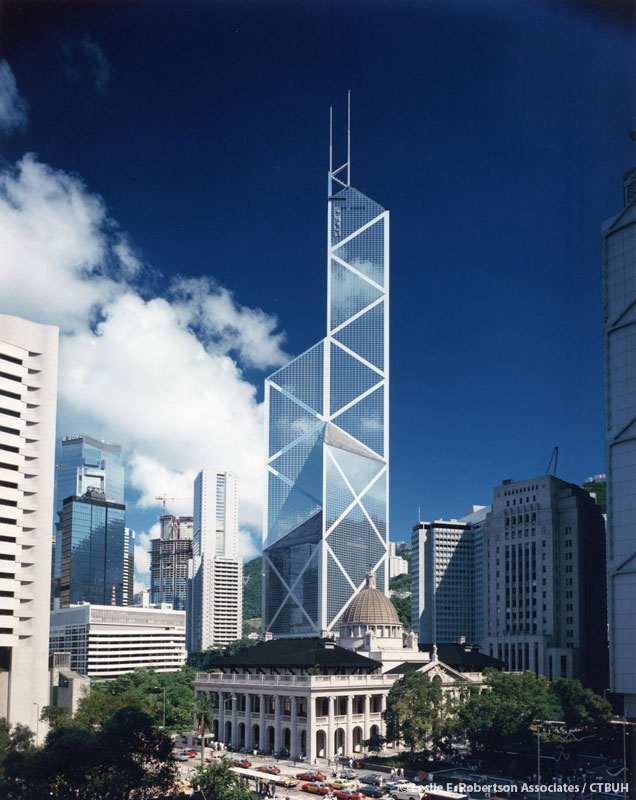
The Bank of China Tower is striking against the Hong Kong skyline, it features complex geometry and many tessellated triangles with variation between each when examined vertically. It also features huge glass curtain walls. Construction began in 1985 and was completed in 1990. It was the first super-skyscraper outside of the US, and is currently one of the tallest skyscrapers in Hong Kong. I really like this building and it looks fantastic at sunset because of the borders between and the reflection it gives off. This is a work that I think exemplifies Pei’s form of embellished International Style. It is modern, but also plays with shapes in a way that draws the eye to various aspects of the design.
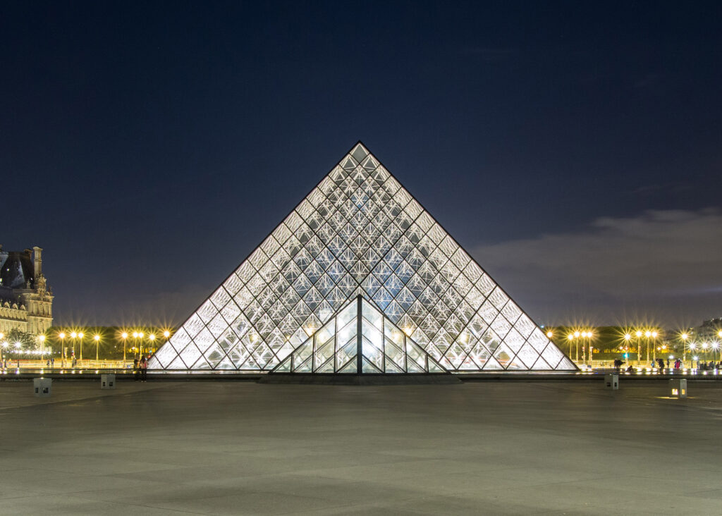
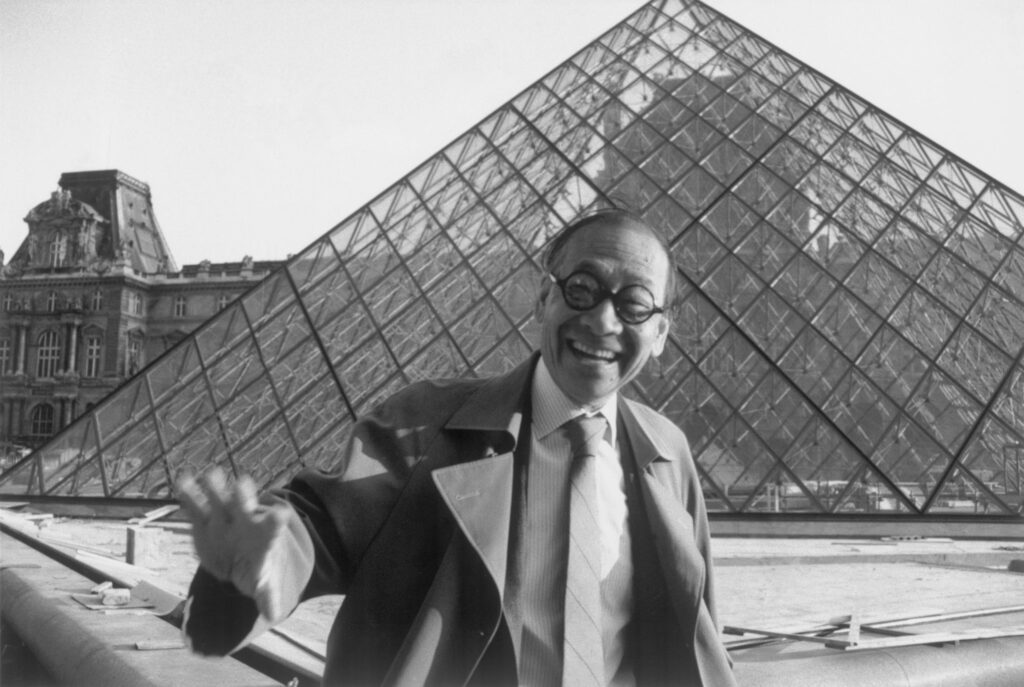
Perhaps Pei’s most famous work, The Louvre Museum is the world’s largest art museum. Pei designed the pyramid that was annexed onto the entrance of the museum (which was a former palace originally) and completed the structure in 1989. The pyramid was meant to allow natural light into the entrance which is a subterranean courtyard. At the time, plans for the pyramid were controversial among both the administration and the public. However, as evidenced today it is one of the most recognized and popular structures and represents Pei’s iconic use of both geometric shapes and use of materials. This is my favorite design of Pei’s and the glass makes it very beautiful, particularly against the surrounding cityscape.
I. M. Pei is a Chinese-American architect born on April 26, 1917, in Guangzhou, China. He grew up in Hong Kong and Shanghai and the elements of architecture within the cities he grew up in had a profound impact on his later works. He attended several schools, beginning at the University of Pennsylvania and later transferred to MIT to complete his Bachelor’s Degree. He went on to get a Master’s in Architecture at Harvard. He was unable to return to China as a result of WWII and began working on several projects in the US after joining the firm of Webb & Knapp post-graduation, and later went on to form his own firm, I.M. Pei & Associates (later Pei Cobb Freed & Partners). He is known for an embellished form of the “International” Style and was particularly noted for the bold use of shapes and contrasting materials within his designs. Among his most notable works are the Louvre Pyramid in Paris and the Bank of China Tower in Hong Kong.
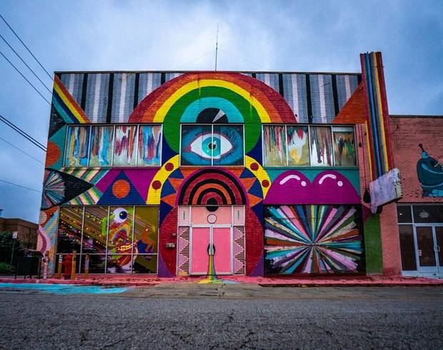
I really love this building, and it is one of my favorite in OKC. It has a very grassroots feel, and I think really reflects a certain community of artistic culture within OKC that I am really proud to have. I like the versatility of the events held here, and always think that the ambiance of the building adds something to the concerts and exhibits held here. When I first saw the building, it obviously caught my eye because of how unique and colorful it was, but I never knew what it was until I was invited to a Halloween party they held a couple of years back, and I learned that it was something of a museum showcasing avant-garde style works. I have been back several times since and it is different every time I go. The interior is just as interesting as the exterior, and it is always really cool to visit this eccentric place.
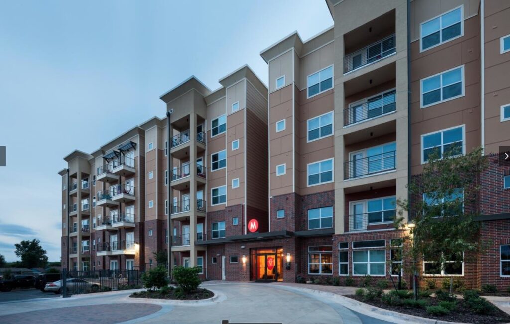
I have lived in this building for several years. From the outside it looks nice, and the amenities and nice pool area are what initially drew me to this complex – as well as the vertical space and how high it rises. However, I have come to strongly dislike this building for various reasons. I am not sure if it is a structural issue, or the ground settling, but I have driven into the parking garage with the same truck every year to move units, and I have noticed that over time the garage ceiling has “sunk”. This is very strange to me as this last year my car actually scraped the ceiling, and it is the same vehicle I have always used, which is really worrisome. I have also noticed that there seem to be mechanical issues with the electric situation. Most of all though, I feel like the design (at least of the units I have been in) is tragically flawed. First, every hallway looks the same and the floor in one building is equal to one floor higher in the other (perhaps because the ground is not completely level). This makes it extremely hard for visitors to make sense of the building, and they often get lost or walk into the wrong unit as the numbering system makes no sense at all. Also, I know it is a personal preference, but yellow and red feel like food colors to me, and not primary colors you would use in housing, but again possibly just personal preference. The worst of all though is the layout of units, it is terrible. There are areas that force you to either have your bed against a wall or a window, blocking natural light; and I feel like this is the worst example of an “open floor plan” as everything is oriented in such a way that does not allow the use of natural light, even with large windows. There is a mounted TV on the west wall immediate to the window so that if you are watching during the day there is a glare unless you close the windows, and the bathroom is placed at less than a 45 degree angle to the large bedroom windows so that if the door is not completely closed all of the neighbors can see you showering. The balcony door is placed directly across from the entry door, so if the doors are not locked they constantly blow open from the pressure. The hallways have strange acoustics to where you can hear conversations being had, even at a normal tone. I could go on and on, but in sum – I strongly, strongly dislike this building and placing furniture or making attempts to place decor have endlessly frustrated me here.
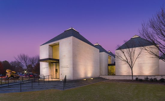
Fred Jones is one of my favorite buildings on campus. I remember thinking how strange the sculpture out front is when I first came to OU, but it has grown on me, I think, for exactly that reason. There are some really great works of art in this museum, and the building itself is very enjoyable to be in. I like how they used several small buildings that are interconnected with hallways that allow natural light in, and the large window on the North end that allows you to see the revolving exhibits from the street view. I also like how they have designed some rooms in the era that reflects the showcase of that particular art. I also even prefer the lecture halls in this building more so than others because of the intimate feeling they give while attending. They are not as steep as some other larger lecture halls, but they also do slant in a way that allows for ease of viewing for the listener.
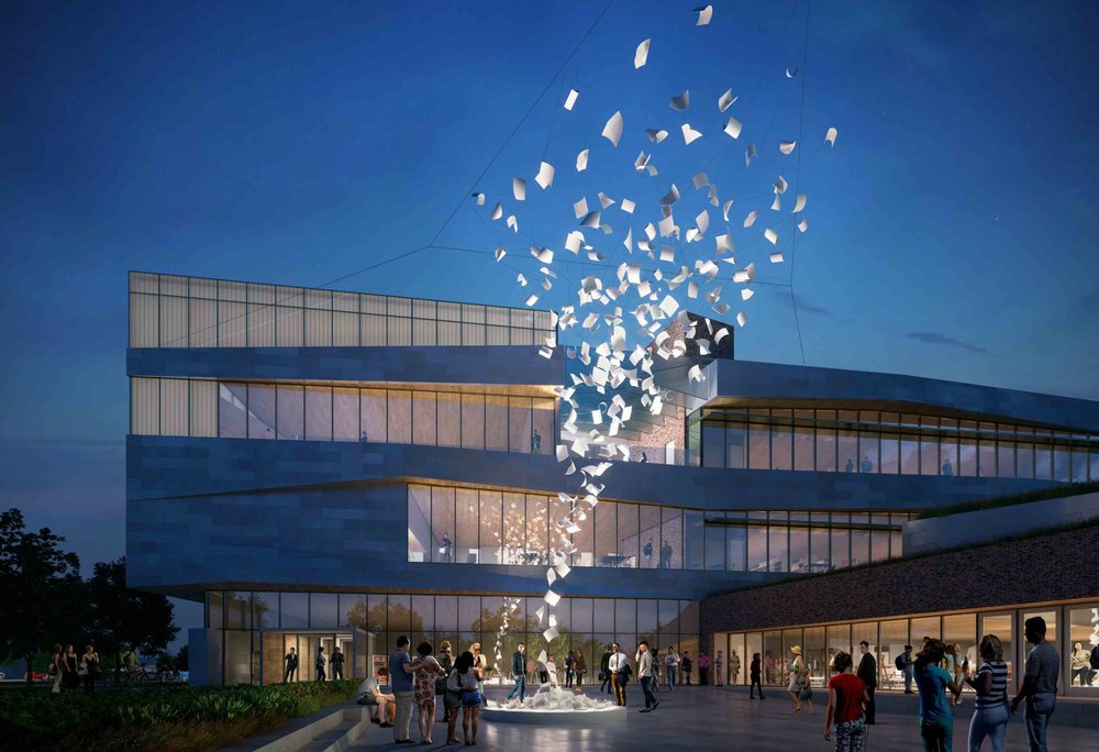
I really love the Norman Central Library. When I initially saw it being constructed I didn’t know what it was, and I was always curious what such a large structure in that particular spot would come to be. When they were finished, and the signs were put up I took notice and made a note to come back and visit. I went to study there later that week and it was very new so there weren’t a lot of people there. It was really easy to find a comfortable spot to study (unlike the Biz, at times), and they really went the extra mile to ensure that there was comfortable seating around the whole building. I love that there are private individual study rooms available to work in, and my favorite spot is a part in the top floor that has a very mid-century feel. That room in particular was designed with a lot of wood and long tables and feels very nice. I also really like the stairs in the main part of the building as they are very interesting to look at, and serve more than just being plain stairs. It seems like they put a lot of effort into the aesthetic design of the building, and it is easily one of my favorite buildings in Norman and I am grateful to have been able to spend time studying there.
Warning: Attempt to read property "comment_ID" on null in /home/thedudeo/fall2020.thedude.oucreate.com/wp-content/plugins/subscribe-to-comments/subscribe-to-comments.php on line 71
Warning: Attempt to read property "comment_author_email" on null in /home/thedudeo/fall2020.thedude.oucreate.com/wp-content/plugins/subscribe-to-comments/subscribe-to-comments.php on line 591
Warning: Attempt to read property "comment_post_ID" on null in /home/thedudeo/fall2020.thedude.oucreate.com/wp-content/plugins/subscribe-to-comments/subscribe-to-comments.php on line 592