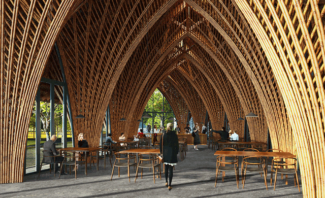
This building was different then all the others because it didn’t have any plants incorporated. However, he seems to love breaking the boundaries of architecture with bamboo, especially here. The way the bamboo bends so intricately to make all the arches and designs makes it look so whimsical to be there. It reminds me of something you would see made out of stone in a castle. I would feel very luxurious eating at this restaurant and getting to feel all the natural light while admiring all the details that were put into all the bamboo.
Monthly Archives: November 2020
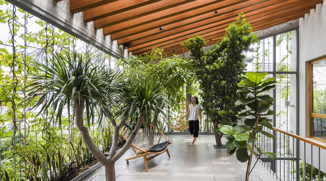
Stepping Park House – In Vo Trong Nghia Architects
This project follows along with the overall theme of this architect. It looks like he likes to blend people with nature and structures with his projects. Especially this one, it looks like a beautiful place to relax and be surrounded by natural light and greenery. The slanted wood ceiling as well adds another outdoor-like element that makes this place even more beautiful. I bet that visitors feel very serine when they pass by or take a seat here, especially if they took all their outside distractions like a cellphone away.
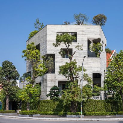
Ha Long Villa – In Vo Trong Nghia Architects
This building was in the residential section of their projects which makes this so much more interesting to me. The fact that they could continue their theme of green architecture even in homes amazes me. I love the uniqueness of this home and just know it has to be expensive. In America, you see so many homes that look the same, but this has a wow factor that I have yet to see here. I would love to see this building in person as well and get to appreciate all of the elements the picture doesn’t capture.
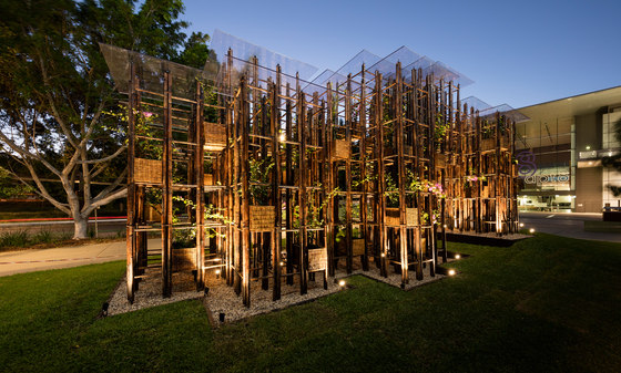
Green Ladder – In Vo Trong Nghia Architects
When I first saw this project, it caught my eye by how unique it was. It seems that In Vo Trong Nghia Architects was very focused on making eco-friendly architecture. I find it so beautiful how the design incorporates both bamboo and plants. I bet it would be even more stunning to see it in person and get to see all the details that were put in. It allows those who visit to get to appreciate both the architecture and the nature involved.
Whitney Musuem of american Art by Renzo piano
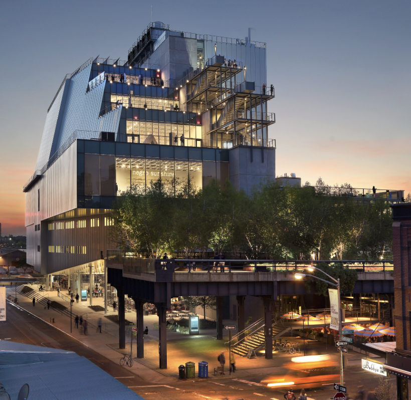
The Whitney Museum of American Art has been established in the city of New York since 1931. However, Renzo Piano was not the lead architect for it. In 2010, he was given the chance to lead a new museum building. In 2015, the construction was finished at the intersection of Gansevoort and Washington streets in New York. The new building is more open and expansive compared to the previous older ones.
The museum displays paintings, drawings, prints, sculptures, installation art, video and photography. The collections of art numbers over 25,000 works of more than 3500 artists. These art pieces takes up an large chunk of the 200,000 square feet space that the building hosts over a span of 8 floors. Due to all of his works in New York, Renzo Piano has been instrumental in changing the New York’s skyline over the years.
Centro Botin by Renzo Piano
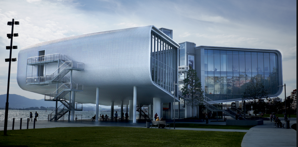
The Centro Botin is a building that Renzo Piano that first opened in 2014. It is Renzo Piano’s first architectural building he lead to be built in Spain. This building is located in the privilege part of Santander, Spain. The Centro Botin is an art centre designed to generate wealth and art development.
The building encompasses 2 blocks on the east and the west. The east side of the block is for cultural and educational activities that hosts an auditoriums, workspace, classrooms, and access to the open roof terrace that can be used to enjoy the view of the coastline. The west side of the block is for art and there are 2 exhibition rooms that equal up to 2500 square feet. This building is truly there for the development of Spanish art and wealth.
Gerrit Rietveld: Private Home for Slegers

Rietveld designed this studio house for an artist, Piet Slegers in 1952-1954. He tends to use a lot of windows in his designs as he did here. He also used a lot of geometric shapes and colors. Here the room that is all windows is the studio/ living room area and the room with less windows is the bedrooms. I like how he always added these shapes and colors into his buildings, here we can see he used red and yellow and designed the windows in a grid like pattern. This is carried into the house as well.

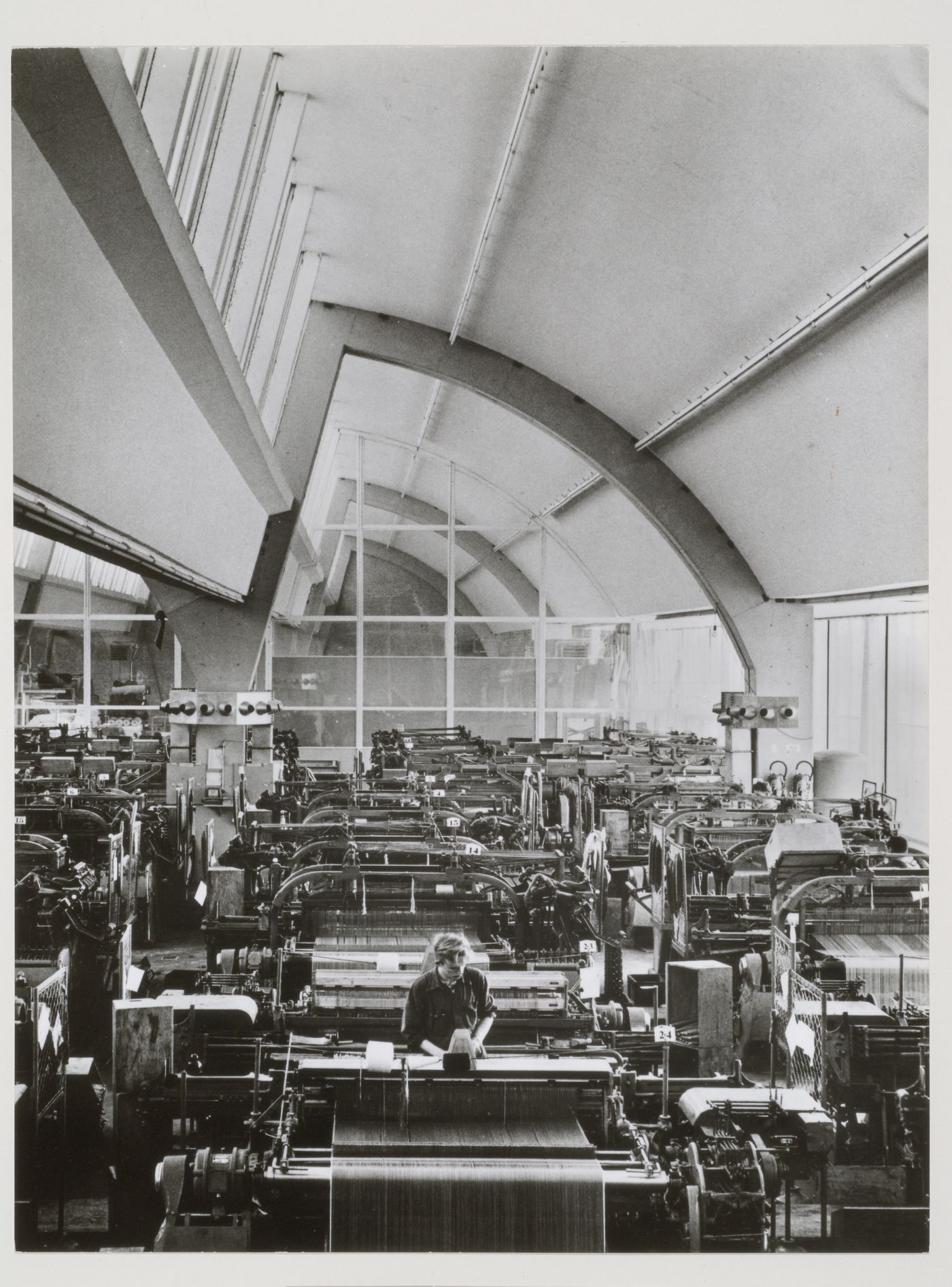
Gerrit Rietveld: De Ploeg

De Ploeg is a textile factory in Bergeijk designed by Gerrit Rietveld in 1956-1960. Again, we can see his love of geometric shapes in his work. I think that this is my favorite building by him, just because it is a factory yet it looks more interesting and more aesthetically pleasing than most building we see in our everyday lives! When I think of innovative designs for factories I tend to think it is a new concept, yet this was designed in 1960. I think it is extremely unique and impressive. The factory was restored but used Rietveld’s original designs. Rietveld also designed the factory with the employees in mind. You can see on the right side of the picture above that each wall had a huge skylight to allow natural light into the factory. He also included a park or garden outside the factory that would allow employees to relax in a green space.


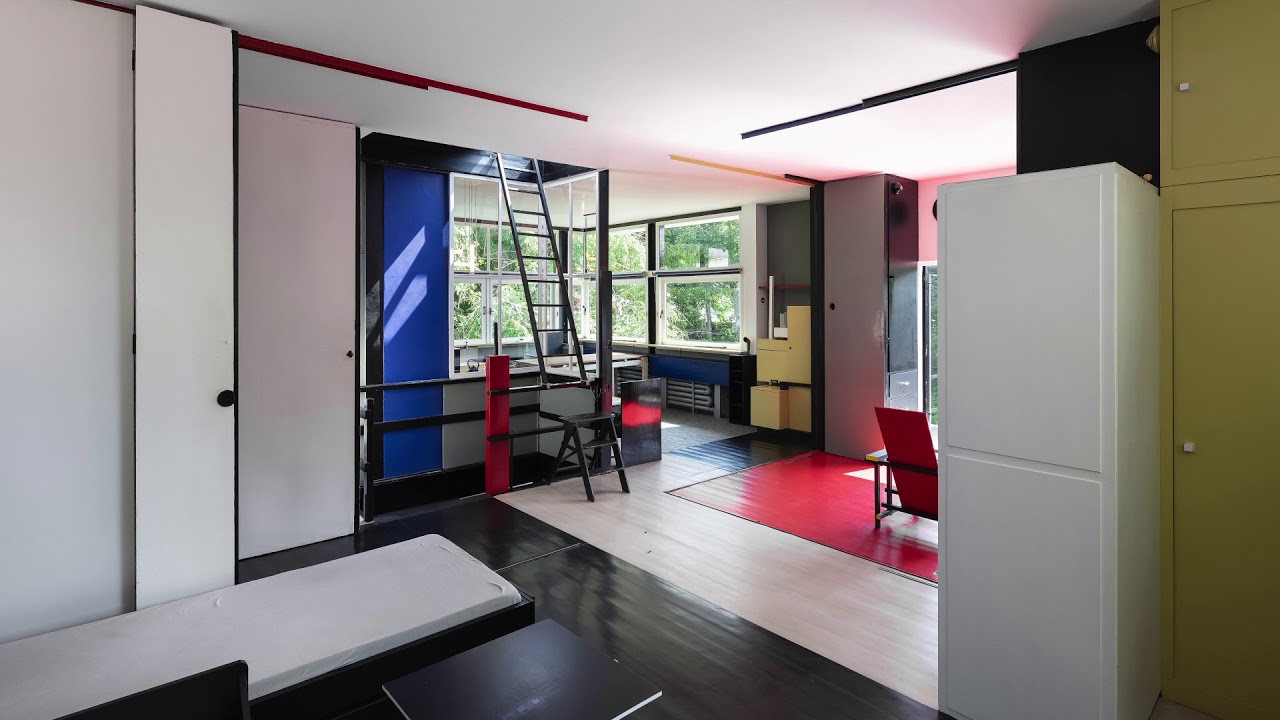
gerrit rietveld: Schroder house
Gerrit Rietveld was famous for his use of geometric shapes, you can see his use of geometric shaped in the Schroder House. Rietveld designed this house for Mrs. Truus Schroder, she wanted her house to be “free from association, and could create a connection between the inside and the outside.” This designed carried into the inside as well. I think this house is so unique and really interesting. Today the house is used as a museum. Something that is pretty interesting about the design of this house is that Mrs. Truus wanted the inside to be able to change from open to closed off rooms whenever she wanted. To accomplish this Rietveld came up with sliding panels that can be open to make one large living area or closed to make rooms.

Felipe Escudero- Casa Roca
Casa Roca is a house designed by Felipe Escudero encompassing 450 square meters.
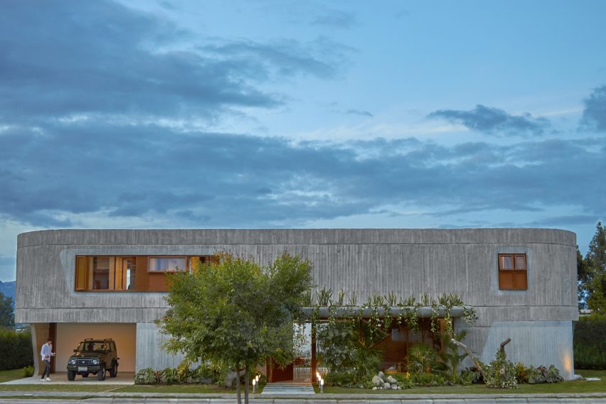
The front of the building is mostly concrete with limited windows to increase privacy. A solid concrete building would look pretty bleak, so the edges are curved, and part of the front is decorated with a verdant garden.
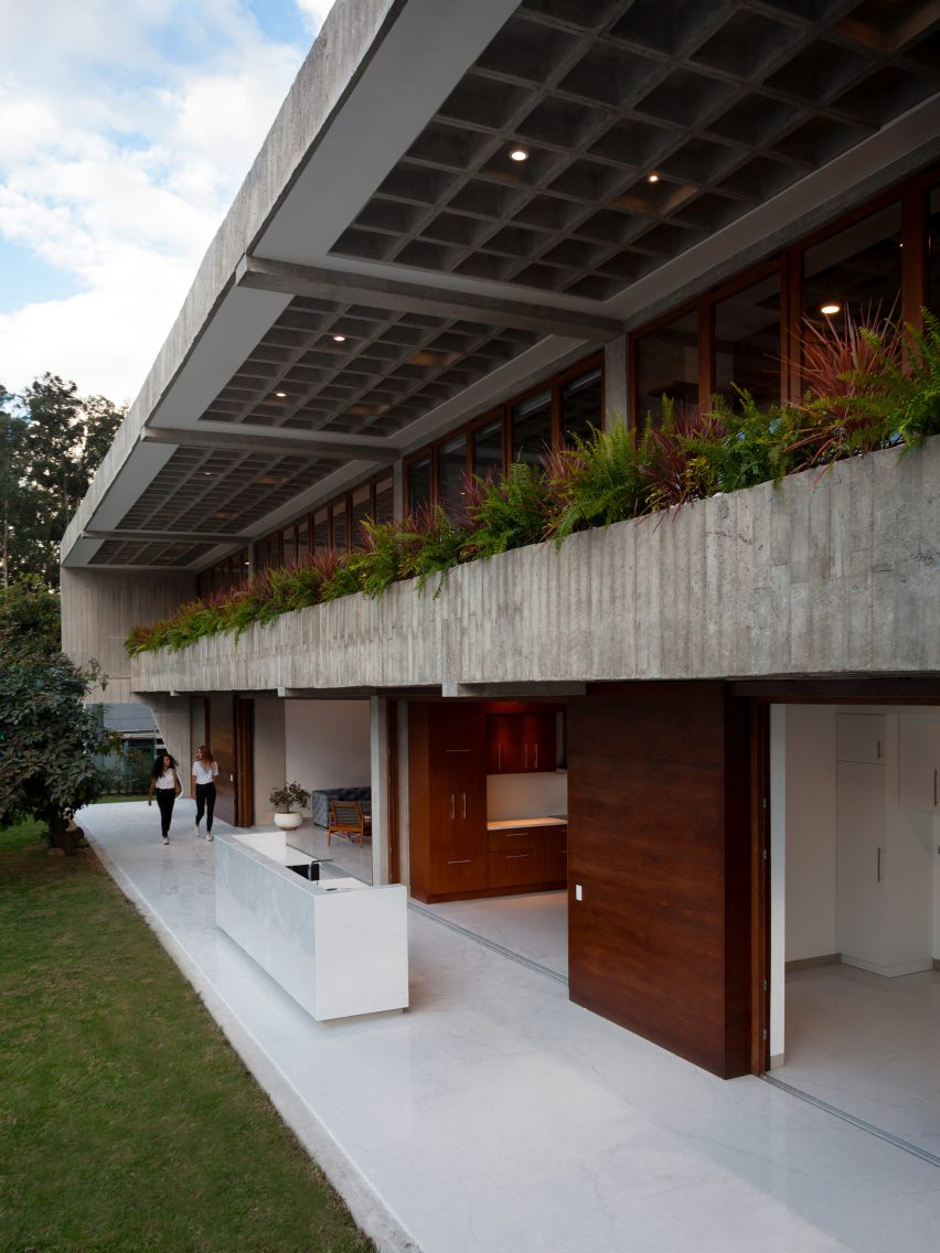
The over use of concrete on the front side is balanced out by an abundance of windows on the rear. The entire second floor has windows covered by a small balcony of plants. The major rooms of the house have massive sliding glass doors that open up into the back patio, blurring the line a bit between outside and inside. I’m not really fond of the idea of the massive glass doors because I like to clearly delineate outside and inside spaces, that and it looks like it would be a bit of a pain to keep clean with the doors open.
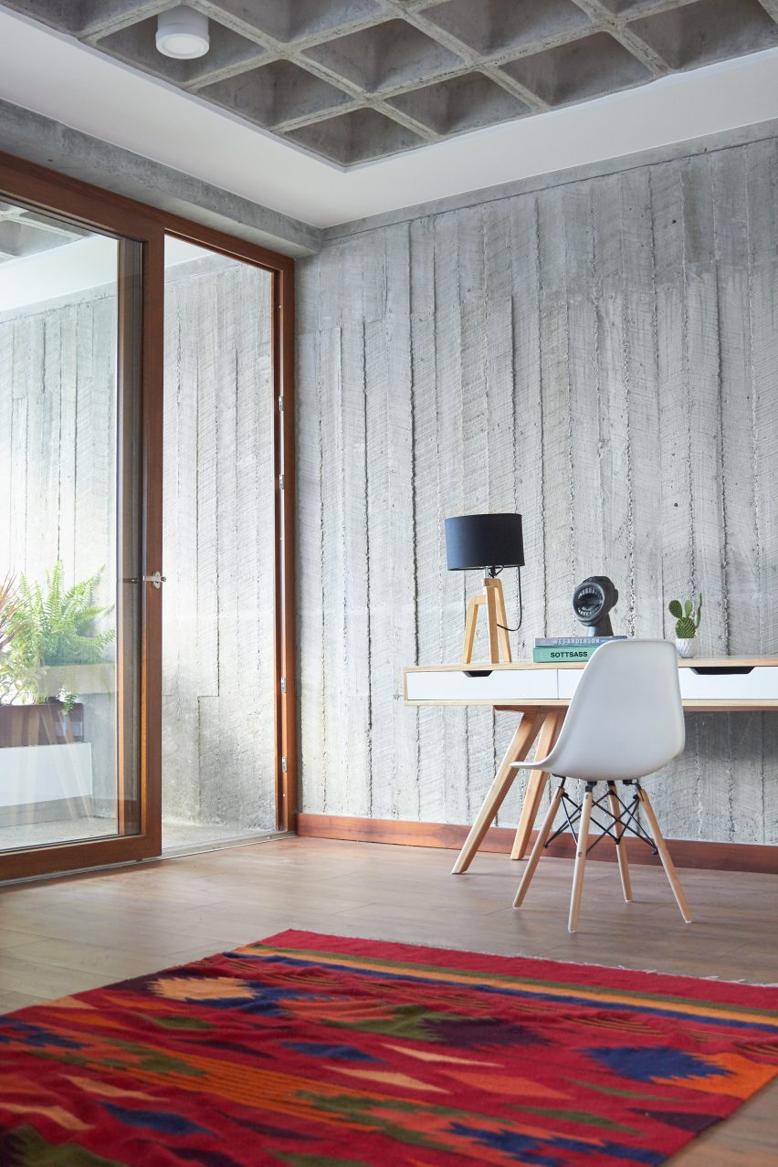
This house uses concrete in a few unusual ways. Escudero uses the boards used to cast the concrete to leave a distinct texture on the walls that I’m not particularly fond of. To me, concrete surfaces should be smooth. The ceiling uses a concrete grid to hide lights and other ceiling fixtures.
I’m not a big fan of this building. I don’t like its style and I think some elements like the glass doors have some design flaws. The flat roof looks like it wouldn’t handle rain very well, which makes me hope that the house has some alternative water management methods. Despite its flaws I think it’s a bit better than most buildings that use so much concrete.